In the Fall of 2014, USAJOBS partnered with The Lab at OPM to use a Human-Centered Design (HCD) approach to re-imagine the user experience on the website. The integrated design team began to collect meaningful data from job seekers, hiring managers, Human Resource (HR) Specialists, and agency Chief Human Capital Officers (CHCOs) through a series of qualitative interviews, behavioral observations, and empathy experiences. I joined the team in October of 2015 soon after this research was complete. Coming into a project where I did not have to push the product owner to conduct research was a refreshing change.
The team conducted 12 focus groups with over 130 people across the country to capture a diverse user population. They spoke with over 80 users one on one to discuss their experiences, needs, and pain points with USAJOBS and the federal hiring experience. Over 2,400 pieces of data were transcribed and visualized in The Lab. Thus coming into the project my small 3-person UX team had a firehose of information pointed at us as we attempted to take the 6 design pillars and 17 recommendations and turn those into a cohesive plan of action.
How we framed the project
My colleague, Min Chung, and I took our oath to the American people on the same day. We joined Ky Taylor who was already working with the USAJOBS Program Office to revamp the application process. Thus we started by helping Ky and the team improve the application process as much as possible. In fact, our first day was a co-design session with members of the 9 Talent Acquisition Systems that USAJOBS connects to in order for users to complete a job application. The Lab has since conducted 10 similar co-design sessions with HR Specialists, CHCOs, federal employees, Veterans, hiring managers, and members of the public. Those sessions typically have a topic that we focus the group on and include activities such as card sorts, affinity diagrams, sketching, and service blueprinting.
After we had shipped the initial revision to the application process I decided we need to build from that strength to modernize the rest of the site. The development team had just used Twitter's Bootstrap, a prototyping toolkit, to make the site responsive. However, this had been done quickly and without the involvement of any designers. Thus there were odd choices in certain places. For example, two hamburger menus on the same page. Thus I formulated two plans.
USAJOBS Design System
The first was to build upon the newly released U.S. Web Design System (then known as the Standards). I had just come off of building several design systems with Nathan Curtis at EightShapes and so I was intimately familiar with what a design system could bring in terms of consistency and continuity across the site. In addition, I knew it would give us a mechanism to start to build a better relationship with the development team and involve them more in thinking about the site holistically.
American Discovery Trail
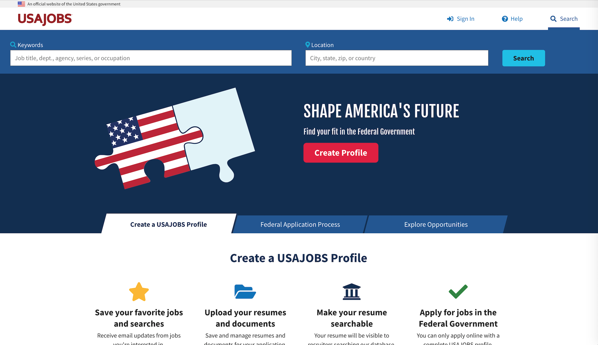
The second plan was a concept: the American Discovery Trail. Named after the actual trail which runs 6,800 miles from coast to coast, our trail would be an optimized path that directs users to relevant jobs. To accomplish this we set out a plan to build and connect a new landing & home page, revitalize search, and redesign the profile in one year. While we understood that working in an agile fashion would likely mean plenty of detours, we wanted to articulate a concept and set an ambitious roadmap in order to galvanize the team around a specific goal.
We picked this concept because:
- Build from a strength: We wanted to build from the success of the new application guide which had given early indications that it was reducing the exit rate of applicants who had decided to apply. Eventually we learned that the exit rate of 7.3% had dropped to 2.7% and we had reduced help desk tickets by nearly 25% as of 8/2016.
- Guide users to the right job: We felt we had given users a good shot of getting through the process once they clicked apply (although there is still a ton more for the systems we connect to do there). Now we wanted to guide them to the right job. This would mean creating a trail: From our landing page to Search to a job announcement.
- Immersive exposure: The Program Office had taken an interest in usability testing. Thus we first tried to get more and more of the team participating in conducting the tests. Then I created and led a weekly Product Owners meeting which gave the design team a forum to express our designs, share usability test feedback results, receive feedback, and iterate on a quick schedule.
What we had learned
More importantly we had pulled three key expectations from the aforementioned research with job seekers and applicants:
1. Guide me to the right job and then through the process.
- USAJOBS falls short of applicant expectations because it presents itself as a one-stop shop for federal hiring, but in reality it is laid on top of a disjointed process spread among 129 agencies, which disorients, frustrates, and misleads users.
- Users are overwhelmed by irrelevant and confusing hiring information on USAJOBS, opm. gov, and other systems which reflects the complicated processes applicants must traverse. This leads to doubt and frustrations that causes them to either over apply for jobs they aren’t qualified for or abandon the application process all together.
- Applying for a government job is a long and arduous process. It is made even worse because the government doesn’t set user expectations up front about what they need to apply and how long it will take them.
2. Explain the job clearly.
- OPM does not communicate eligibility and qualifications in a meaningful way. Applicants do not understand that there are prerequisites to being considered for a job. They apply to jobs they can’t get resulting in increased applications, workload for the government, and frustration for multiple users in the system.
- USAJOBS isn’t giving anyone everything they need so applicants, agencies, and the USAJOBS Program rely on other websites and people to find jobs, get and give answers and post job information because they are more successful avenues. This further exacerbates the already fractured hiring process. While delegated examining makes this difficult, OPM currently owns the responsibility of managing job announcements.
3. Don't be a black hole.
- Notifications from USAJOBS and letters from agencies are not in plain language. This results in confused applicants calling HR offices. HR Specialists become frustrated and avoid communications with unselected candidates.
- Applicants do not receive notifications in a timely manner. By the time an applicant receives notification they may no longer find it useful or applicable to their job search. This diminishes trust and reliability of the system.
- The Talent Acquisition Systems and USAJOBS operate almost entirely independently and issue multiple, separate notifications at different points in the process, if at all. This is confusing to applicants.
- HR Specialists need the hiring manager to decide who is moving on before notifications can be sent which causes delays.
We had a few high level goals for the trail:
- Start to change the perception of the hiring process to increase engagement.
- Improve confidence in the federal hiring process by guiding users to relevant jobs.
- Reduce the number of ineligible applicants to lower the workload of HR and improve the system.
- Identify policies that complicate the hiring process and practices for future improvements.
In addition to these goals we had specific Key Performance Indicators (KPIs) for reach release that would allow us to measure our progress as we made changes.
What we did: Prototype, test, build, ship
The new application guide shipped in February 2016 and from there we went about building the trail. The next release adopted our new Design System which in turn had us adopt the base elements of the U.S. Web Design System. We didn't convert the entire site at once to every element and component in the system. But we did pick up the colors, typography, and grid in this first release and then inventoried and prioritized the components we would adopt next. Navigation was the top component and so that was done first.
In order to speed up our output I also decided around this time to convince the development team to let the design team own the help site. At the time the site was a MediaWiki that was in need of desperate pruning. We conducted a number of card sort activities with users and took an inventory of the content. I also paid close attention to lessons learned from healthcare.gov and decided to build the Help Center site with simple, open tools, like github and jekyll, that would generate a static site that would not buckle under our traffic, regardless of where it was deployed. This is a pattern I've since used a number of times, deploying those sites to GitHub pages, and now to cloud.gov via 18F's Federalist.
I combined that pattern of building small, static sites, with what I had learned at EightShapes: Get to full fidelity prototypes as quickly as possible. By creating prototypes and usability testing them with users we were able to learn and iterate ahead of handing the design off to development. While not the ideal agile practice of having designers and developers working together, which was difficult given that they sit in different locations (Washington, DC and Macon, GA), it did allow us to raise the quality of what we were delivering.
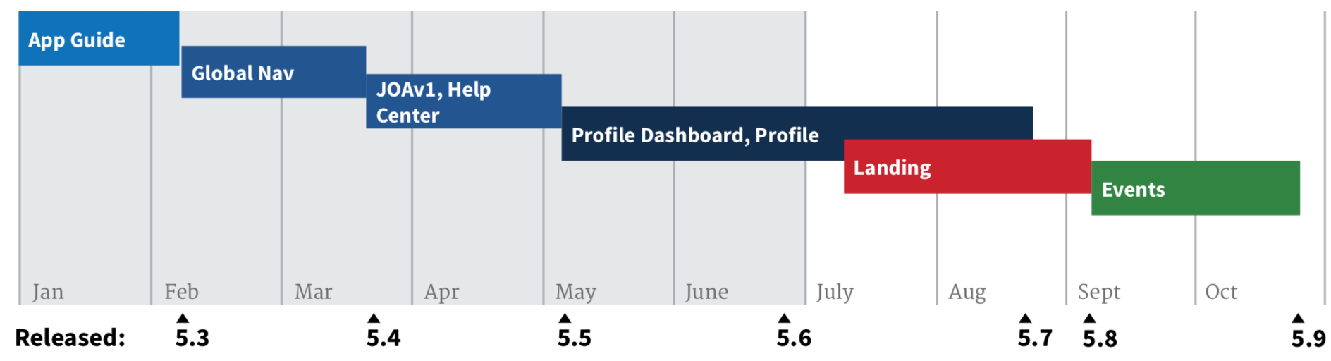 Releases shipped in 2016
Moving into 2017 we replaced our search engine with Elasticsearch and focused on the relevance and precision of our search results. We also revamped the job announcement and created a job announcement playbook. In 2018 I played a role in pushing for integration with login.gov. After that I was asked to spend 3 months on leading a project that demonstrates the initial capability of an automated hiring advisor for managers, a key milestone of CAP goal 3 (Developing a Workforce for the 21st Century) of the President’s Management Agenda. Once I returned from that project we focused on further improvements to the user profile of the Core product as well as enhancements to the Open Opportunities site that we inherited from GSA's 18F.
A nod to the WPA
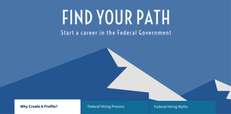
 USAJOBS landing page - Final
 USAJOBS landing page exploration - v2
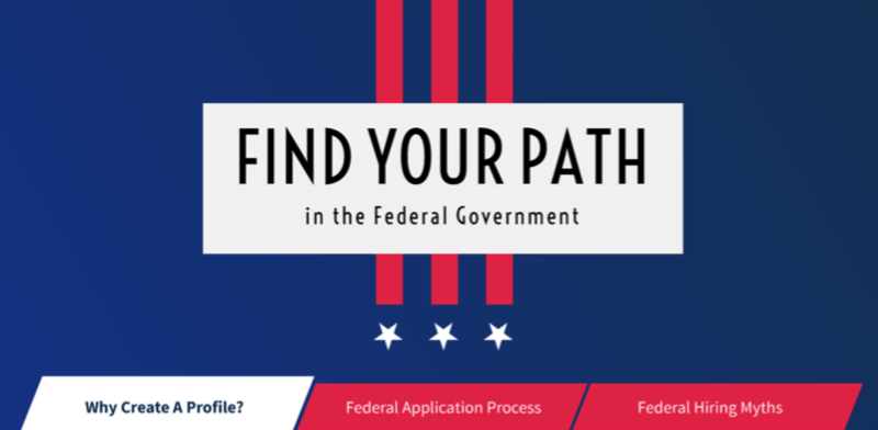 USAJOBS landing page exploration - v1
As we started revising the landing page of USAJOBS I wanted to ground the work in a uniquely American graphic art perspective. The design team also wanted to infuse USAJOBS with a strong visual identity. I've long been a fan of the graphic posters created for the Work Projects Administration (WPA) and I was reminded of that by the WPA-inspired NASA travel posters that The Studio at the Jet Propulsion Laboratory had recently created. Thus I did some research and found a number of similarities:
- Massive scale: Between 1935 and 1943, when the agency was disbanded, the WPA employed 8.5 million people. USAJOBS averages 19,355,566 applications started per year.
- Federal front-door: USAJOBS is a modern work project - It is how the modern American finds work provided by their Government. It averages 21,461,750 visitors monthly and hosts an average of 37,768 jobs per month.
- Timeless graphic art: The WPA posters employ timeless icons to depict people, places, and natural elements. The simplified graphic style appeals universally to broad audiences from varying economic, educational, and cultural backgrounds. The timelessness of the art of the posters and their appeal to a broad audience were goals of ours as well.
What we accomplished
Job seeker expectation
1. Guide me to the right job and then through the process.
Clarified eligibility
- We’ve brought some consistency to how we explain eligibility and standardized how USAJOBS and the Talent Acquisition Systems (TASs) it interfaces with handle hiring authorities. We did this through the creation of hiring paths. Hiring paths use consistent language and iconography throughout the core site and our other products (Agency Talent Portal and Open Opportunities) to identify when a job is open to a specific group (Federal employees, Veterans, Students, etc.).
- Engaged OPM Policy to create hiring path pages written in plain language which connect users to valuable resources.
Problems targeted
- Users don’t understand the difference between eligibility and qualification.
- Users don’t understand or accurately claim the preferences they have.
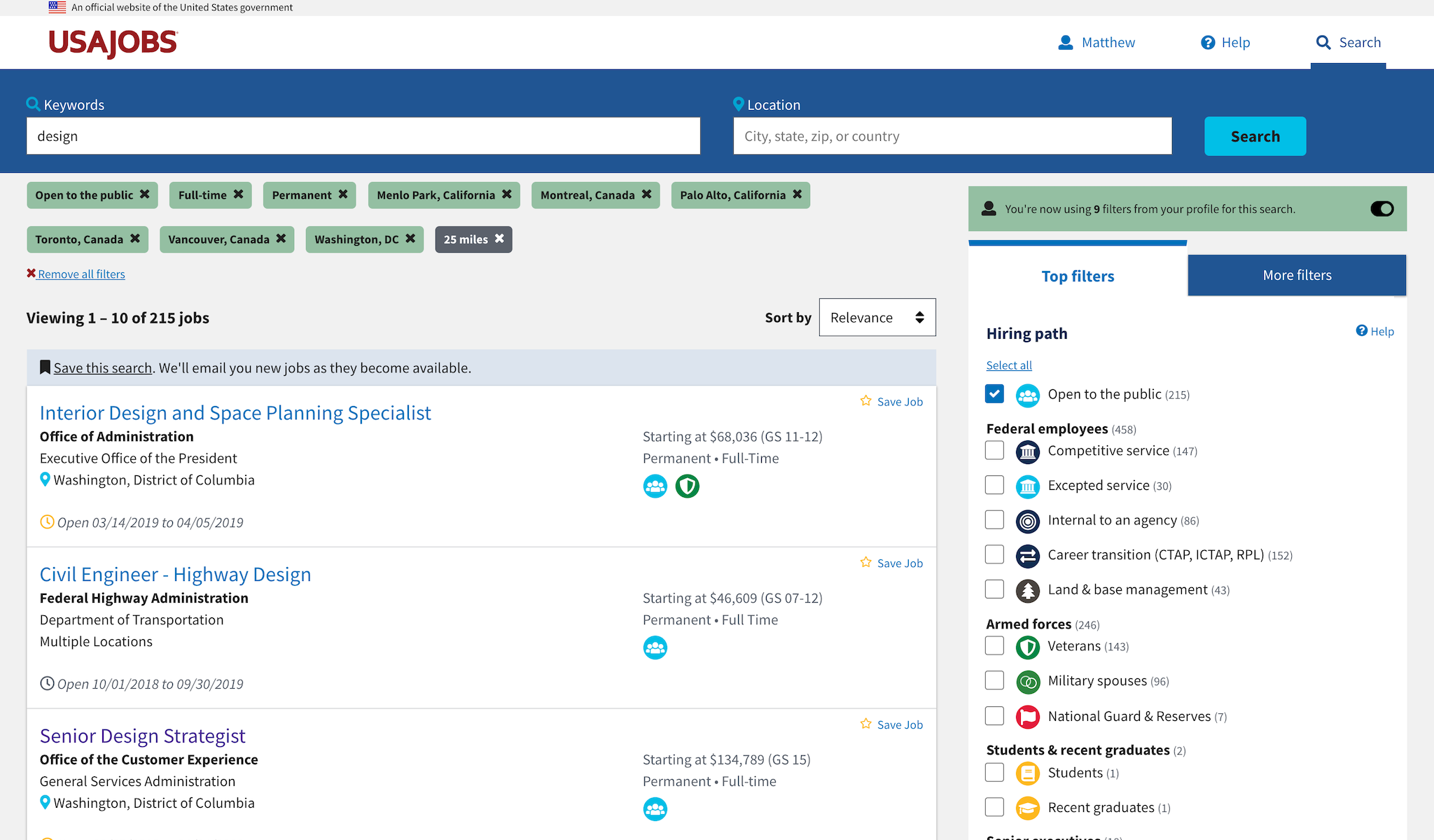
Improved keyword search
- Improved the relevance and precision of search results by switching to the Elasticsearch engine.
- Provided a way to leverage your profile to add filters.
- Search success rate up to 62% when filters are applied as of 6/2017.
- Keyword auto-complete against job titles, occupations, series, departments, and agencies.
- Dept. of Labor Standard Occupation Classification (SOC) to OPM Series mapping to support occupation auto-complete.
Problems targeted
- Going directly to search results is a poor initial experience.
- Search results include jobs the applicant is not eligible or qualified to apply for.
- Search results include language users don’t understand.
Integrated with login.gov
- Reduced customer support tickets by 47%, a new all-time low.
- 2-factor authentication to increase security.
- Removed inactivity lockouts.
- Improved password reset process.
- Increased the active user population by 43%.
Problems targeted
- An overwhelming majority of help desk tickets were related to authentication and account problems.
Guided users through the initial steps of the application process
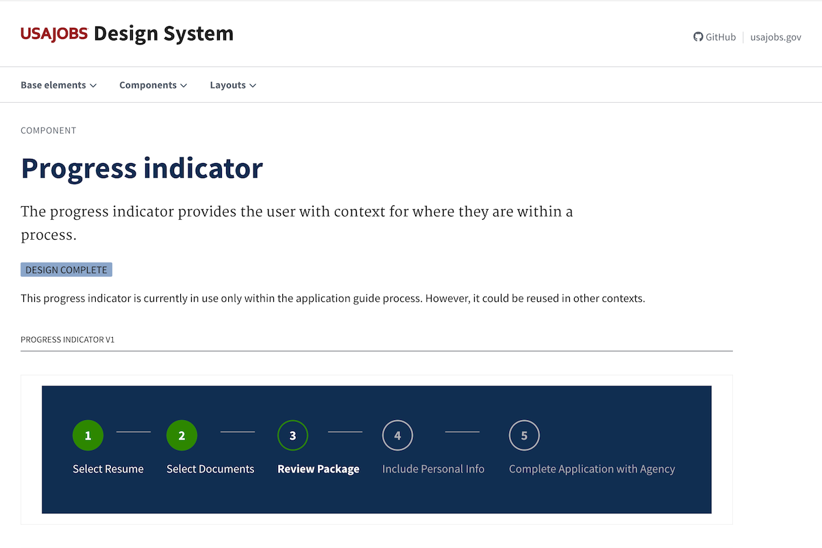
- Reduced exit rate from application guide from 7.3% to 2.7% as of 8/2016.
- Reduced process to 5 steps.
- Reduced the number of incomplete applications submitted to agencies.
- Improved transparency about the contents of an application package.
Problems targeted
- High exit rate from application process.
- Users are confused when transitioning to Talent Acquisition Systems.
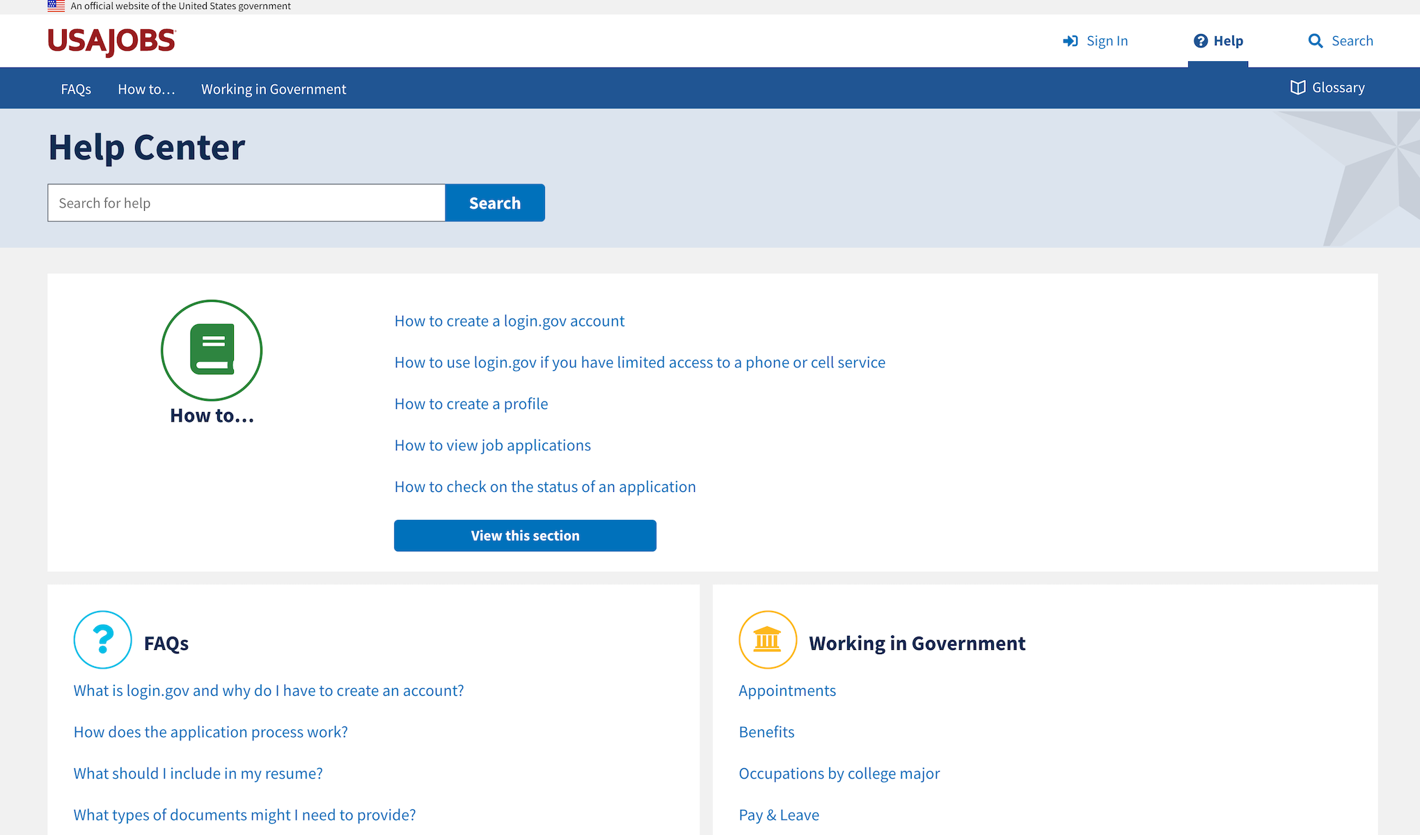
Created a Help Center
- Replaced a forlorn mediawiki with a structured Help Center rewritten in plain language.
- Drive users to help content instead of depending on reacting to help desk support requests.
Problems targeted
- Users don’t understand the entire federal hiring process.
- Help content uses jargon that users do not understand.
Created a home for job seekers
- New landing page content created clear calls-to-action to sign-in, create a profile, or begin a search as well as provides an overview of the federal hiring process.
- Created a dashboard that provides an overview of applications that you have submitted and makes it easy to pick up where you last left off.
Problems targeted
- Applicants wanted a “home base” that grounds them in the ongoing process.
- "Direct-to-search" traffic, those who come to the site and immediately begin perform a search, decreased by 16%.
Help Center
Search
Job announcement
Job seeker expectation
2. Explain the job clearly.
Revised the job announcement twice
- Clarified eligibility by working with Talent Acquisition System (TAS) vendors to convert the free- form text of “Who may apply” into a normalized data set which HR Specialists now select from when creating an announcement.
- Improved USAJOBS conversion rate to 9% (as of 5/2017) from 7%. Conversion happens when a seeker who searches for a job, visits an announcement, and clicks apply.
Problems targeted
- Job seekers cannot determine their eligibility by looking at the announcement.
- Job announcement contains duplicative information.
- Legal requirements bloat job announcement content by putting too much unclear information up front, obscuring key information which causes applicants to skim or miss information.
Created a Job announcement Playbook
- The playbook provides best practices to HR Specialists for creating job announcements.
- The playbook also provides a digital resource we can use to communicate best practices.
Problems targeted
- Many job announcements are not written and reviewed with a job seeker in mind but instead are more focused on regulations, which impedes the ability for the government to attract qualified candidates.
- Non-federal job seekers need help understanding government language.
- The Delegated Examining Operations Handbook that HR specialists must be familiar with is 351 pages long and has not been significantly updated since 2007.
Co-designed and prototyped the Hiring Manager Advisor tool
- Grounds hiring managers in the process and intelligently collects the data the HR Specialist needs to create a job announcement.
- Shows empathy for the user and the tasks they need to complete.
- Facilitates the initial conversation between managers and HR Specialists.
Problems targeted
- Many hiring managers are unaware they’re the lynch-pin in a successful hiring process and agencies are unaware of the best practices that would help them improve hiring outcomes.
Job seeker expectation
3. Don't be a black hole.
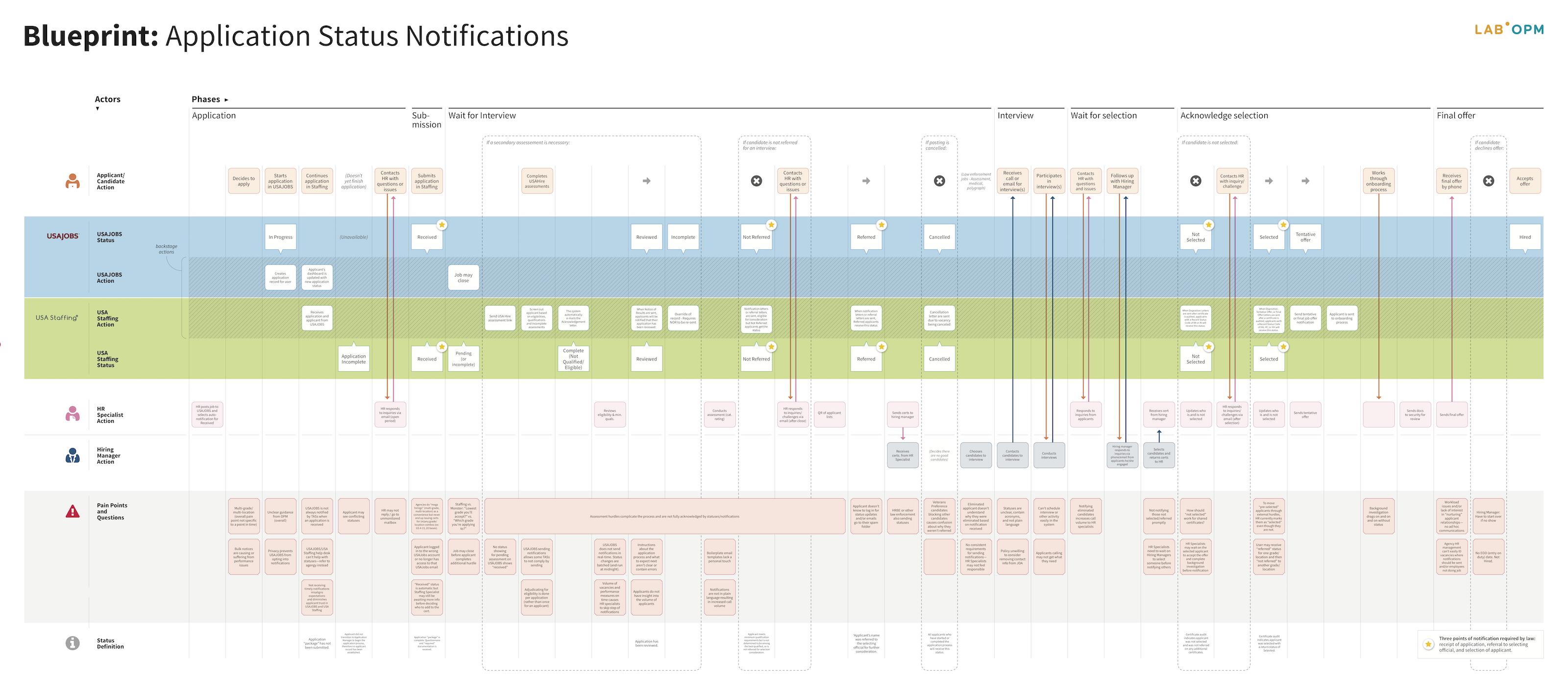
Co-created a service blueprint
-
In the Summer of 2018 we started to focus on this problem in earnest. The USAJOBS and USA Staffing Program Offices, led by The Lab, co-created a service blueprint to gain a shared understanding of how application statuses are updated and
when notifications are sent currently.
-
This blueprint details when notifications and status changes happen so that we could understand pain points that job seekers, applicants, and HR specialists have across this process.
Problems targeted
-
The Talent Acquisition Systems and USAJOBS operate almost entirely independently and issue multiple, separate notifications at different points in the process, if at all. This is confusing to applicants.
Where we are now
The Lab has just completed a North Star project that provides a vision of the future of federal hiring. In addition, I am actively involved with the U.S. Digital Service on a project to revamp the competitive service.