Over seven weeks I was the lead designer working with Cisco to make their Support home page responsive. We sketched together in-person, gathered the best ideas in wireframes, prototyped two versions which were tested by a small set of users, and then tested a final version with attendees of Cisco Live.
The client had clear KPIs and we drove to a minimal, prioritized list of content for the page. This enabled us to quickly focus the page on the goals of their users and remove distractions in order to achieve what Cisco was after.
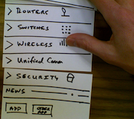
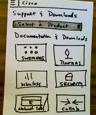
Sketching involved our project stakeholders immediately in a concrete way that allowed us all to visualize the ideas we had brainstormed. From there it was a straight forward task to apply some basic UI patterns that we knew would work responsively (drawers, tiles) in wireframe form.
Prototying in the browser allowed us to show how a strong typographic system, which we developed while integrating some visual explorations from another agency, would provide a hierarchy that reflected the content priorities we had defined. Being able to prototype quickly gives me an opportunity to present multiple high-fidelity versions with deep interactions that can be put directly in front of users.
The project, like any good collaboration, was not without challenges. But I strive for transparent communication and worked hard to refocus the project on the KPIs that the client had stated at the outset. This prompted my teammate to write:
Matt did a good job of setting expectations, defining the desired feedback, and presenting the design. Matt helped facilitate a major shift in Cisco's design system… He coordinated changes in his project with work in other projects, and facilitated a number of client conversations on both general design direction and design details. This work ushered in the larger shift executed in later projects.
On this project
- Wireframes
- Mobile-first prototyping
- Design Research
- Close collaboration
Tools
- Sharpies & paper
- Adobe InDesign
- Adobe Illustrator
- Sublime Text 2
- Chrome
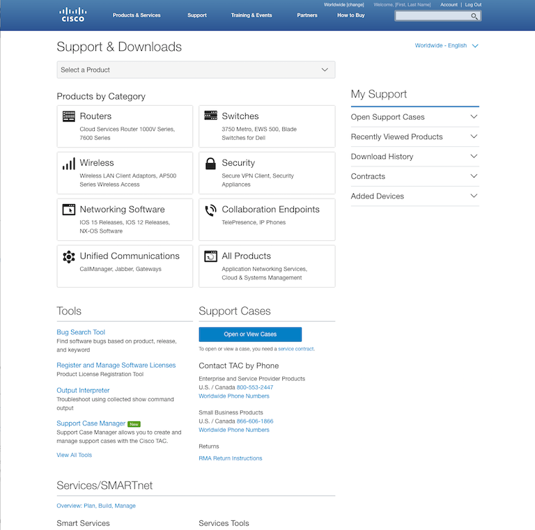
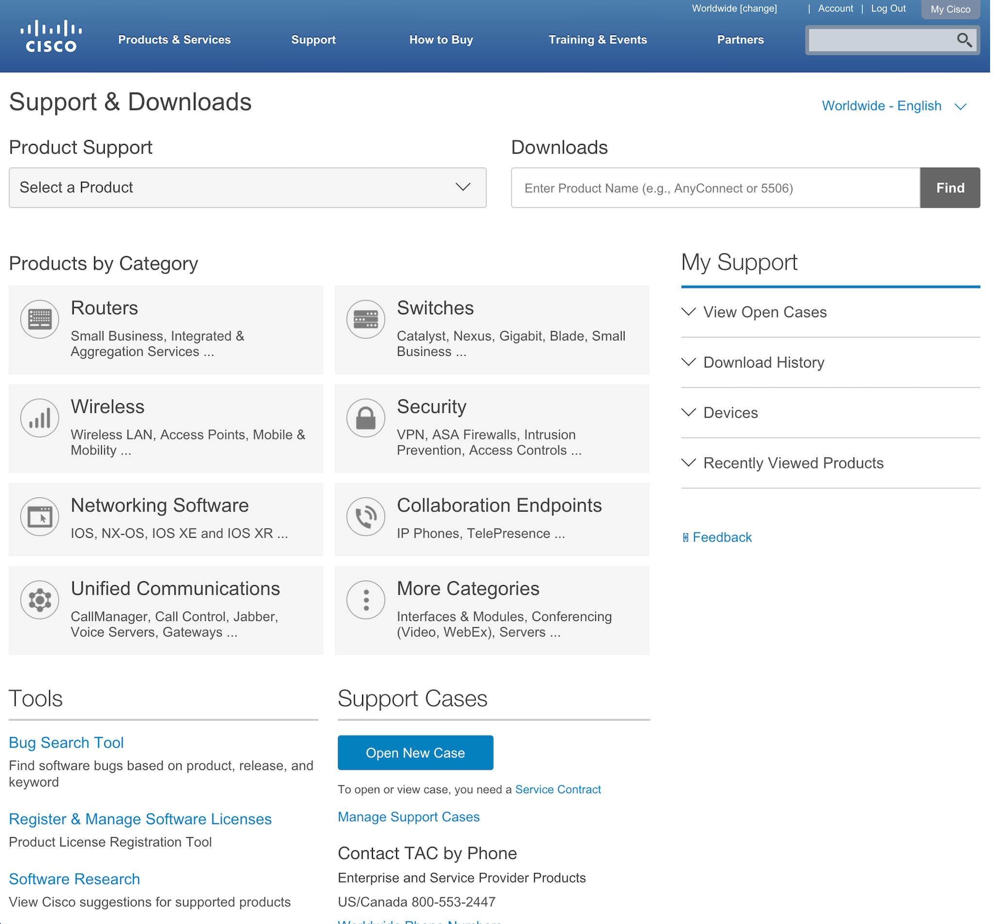
In the end, I combined the two versions to utilize the drawers of version A for narrower viewports and the tiles of version B for wider viewports. This allowed mobile users to drill down into product documentation and allowed desktop users to find the downloads and tools that they rely on. This new version was tested again and iterated on by the client and has recently launched.
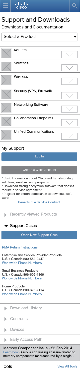
Version A: Too drawer heavy
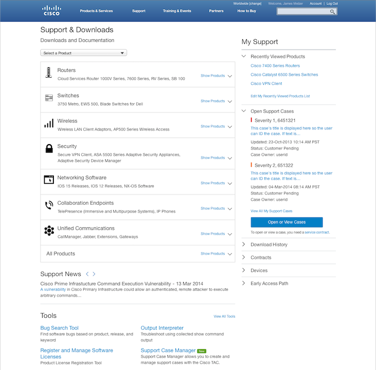
Version B: Problematic tabs
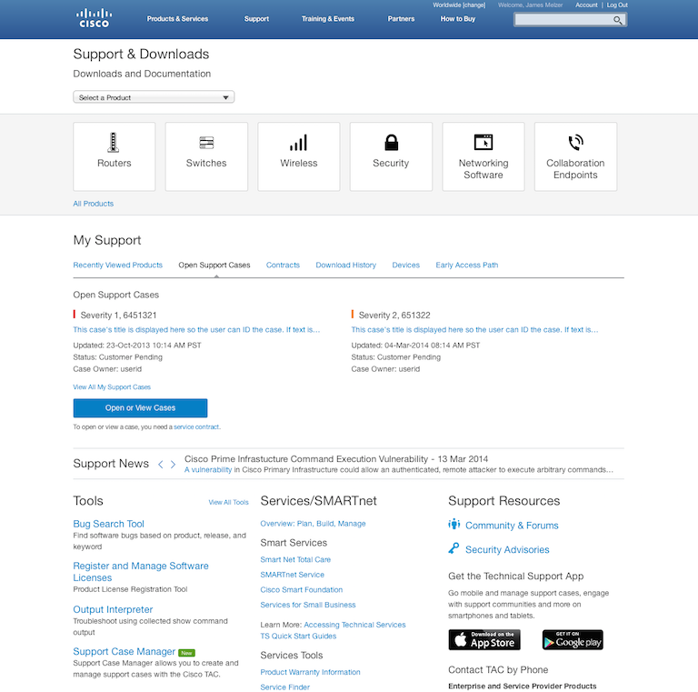
Version C: Balance